
Why the Maths of Colour Controls the Sum of All Parts in Apparel

Colour Is Too Important to Leave to Chance
Print will always be the part of the garment people see first.
But the sum of all parts — the fabric, the trims, the fasteners, the finish — is what determines whether a design actually delivers on its promise. Brands that continue to treat colour as a single creative decision, rather than a coordinated technical discipline spanning their entire supply chain, will keep paying for it in re-dips, delays, and disappointed design teams.
What if the single biggest threat to your next collection isn't the design, the fabric, or the price point — but a beige button that doesn't quite match a beige jacket?
It sounds trivial. It isn't.
Colour in apparel is not a single decision made once by a designer and rubber-stamped by a supplier. It's an equation with dozens of variables — fibre type, dye chemistry, lighting conditions, trim material, production location — and if even one of those variables is wrong, the whole garment fails. Print gets the glory in most design conversations, but print is only one line item in a much longer sum. The real work of colour happens across an entire ecosystem of decisions, and getting that maths wrong is costing brands time, money, and credibility.
Colour Is a System, Not a Swatch
During a recent Coloro-hosted panel on colour management, Scott Watkins, Chief Sustainability Officer at Kisco, Angela Mueller, Digital Manager at YKK, and John Newton, Head of Colour Technology at Coloro, laid out a case that should reframe how every apparel brand approaches colour: it is not a creative afterthought, it is a supply chain discipline.
As John Newton put it, effective colour management "isn't confined to a single stage of production." It relies on brands setting clear tolerances for colour match, metamerism, and fastness — alongside compliance requirements such as ZDHC and bluesign — before a single swatch is sent to a supplier. From there, suppliers need standards that match exactly what the brand has chosen, ideally supported by digital colour data, shared illuminant sets, and consistent light-booth conditions.
This is the uncomfortable truth many design teams overlook: a colour isn't "right" until it's right everywhere it needs to appear — on every fibre, every trim, every production site, under every light source it will ever be seen in.
Different Fibres, Different Rules
Here's where the maths gets genuinely complicated. As Scott Watkins explained, different fibres absorb chemicals in fundamentally different ways. That means the same target colour often requires an entirely different dye recipe depending on the substrate — cotton, polyester, blended fabrics all behave differently, and unless that's accounted for from the outset, brands end up chasing a moving target.
This is compounded by metamerism — the phenomenon where two colours appear to match under one light source and diverge under another. Newton was direct about this: too many teams focus only on primary matching under standard daylight conditions and forget to check performance under other illuminants, which is precisely where dye chemistries are hardest to control. A jacket that matches perfectly in the showroom can look mismatched under shop lighting or daylight — and by the time that's discovered, the damage is already done.
The commercial implication is clear. Cross-material matching cannot be treated as a downstream quality check. It has to be engineered at the start of development, tested across fibres and lighting conditions before production begins, not after.
The Trims Problem: Small Parts, Big Consequences
If fibre-to-fibre matching is complex, fibre-to-trim matching is where many collections quietly unravel. Angela Mueller made the point plainly: a consumer may never choose a jacket because they love its zipper, but they will absolutely notice if that zipper doesn't match. A green jacket with a zip tape that reads slightly off isn't a minor imperfection — it reads as a quality failure, undermining the entire design vision.
The challenge is structural. Zips, buttons, and buckles are typically made from entirely different materials to the fabrics they're paired with, dyed through entirely different processes, and are prone to visual effects like shine that fabric doesn't share. An exact match isn't always physically achievable — and that's a fact brands need to confront early rather than discover late.
Salinas's guidance is one every design and sourcing team should adopt: know what's feasible before you commit. Where a true match isn't achievable, a deliberate, confident contrast is a far stronger design choice than a near-miss that reads as a mistake.
Neutral Shades: The Deceptively Difficult Middle Ground
There's a persistent assumption in apparel that the hardest colours to execute are the boldest ones — neons, fluorescents, the shades that demand attention. They do present real challenges: Scott Watkins confirmed that fluorescent and neon dyes typically have lower light fastness and are genuinely harder to reproduce consistently.
But the bigger, more commercially damaging problem hides in plain sight: neutrals. Beiges, greys, light browns — the "safe" colours — are often built from multiple dyes in combination, which means small variations compound quickly. Human vision, Watkins noted, is exceptionally sensitive to subtle shifts in these tones. Consumers may not be able to name why a beige coat looks "off," but they'll notice.
This is precisely why compatible, purpose-built dye systems matter — formulations engineered for reproducibility, balanced fastness performance, and consistency across fixation and washing conditions, rather than dyes chosen for one attribute in isolation.
Scaling Without Losing Control
Multiply all of this across multiple suppliers, print, dye houses, and manufacturing sites, and the challenge compounds again. Global brands need the same colour to look identical whether it's produced in one factory or five, on one machine or fifty, with different water quality and temperature conditions at every site.
Watkins was clear that this is achievable — but only through proven, compatible dye combinations that deliver "right first-time" performance, developed in partnership with dye technologists rather than left to individual factories to interpret. Newton reinforced this from the standards side: brands and dye houses that share digital colour data — such as QTX files — before physical samples even arrive give suppliers a head start on recipe creation, cutting down on the costly cycle of re-dips, courier shipments, and lab resource strain.
The sustainability dividend here is significant, too. Watkins pointed to dye technologies designed to reduce water and energy consumption by removing unnecessary washing steps — meaning brands can achieve consistent colour at scale while genuinely reducing environmental impact, not just claiming to.
The Real Cost of Getting It Wrong
None of this is theoretical. As Newton noted, when colour inconsistencies do surface, they're typically caught late — after materials from different sites have already been dyed, delivered, and assembled. At that point, the options are disruption, cost, or outright cancellation of the product. Every panellist converged on the same root cause: palettes shared with supply chains before feasibility has been checked.
This is the single highest-leverage fix available to brands today. Not a new dye. Not a new supplier. A change in sequence — checking whether a colour can actually be achieved, across every fibre, trim, and production site it needs to appear on, before it's locked into a collection and sent downstream.
Colour Is Too Important to Leave to Chance
Print will always be the part of the garment people see first. But the sum of all parts — the fabric, the trims, the fasteners, the finish — is what determines whether a design actually delivers on its promise. Brands that continue to treat colour as a single creative decision, rather than a coordinated technical discipline spanning their entire supply chain, will keep paying for it in re-dips, delays, and disappointed design teams.
The brands getting this right are the ones investing early — engineering feasibility into their palettes, aligning standards across every partner, and treating colour scientists and dye technologists as strategic collaborators rather than downstream vendors.
Getting the maths right isn't optional anymore. It's the difference between a collection that performs and one that quietly fails on the rail. If your organisation is ready to build colour feasibility into the earliest stages of design and sourcing, now is the time to start that conversation with the specialists who live in this discipline every day.


Colour Is Too Important to Leave to Chance
Print will always be the part of the garment people see first.
But the sum of all parts — the fabric, the trims, the fasteners, the finish — is what determines whether a design actually delivers on its promise. Brands that continue to treat colour as a single creative decision, rather than a coordinated technical discipline spanning their entire supply chain, will keep paying for it in re-dips, delays, and disappointed design teams.
A Century of Textiles, and an Ever-changing World
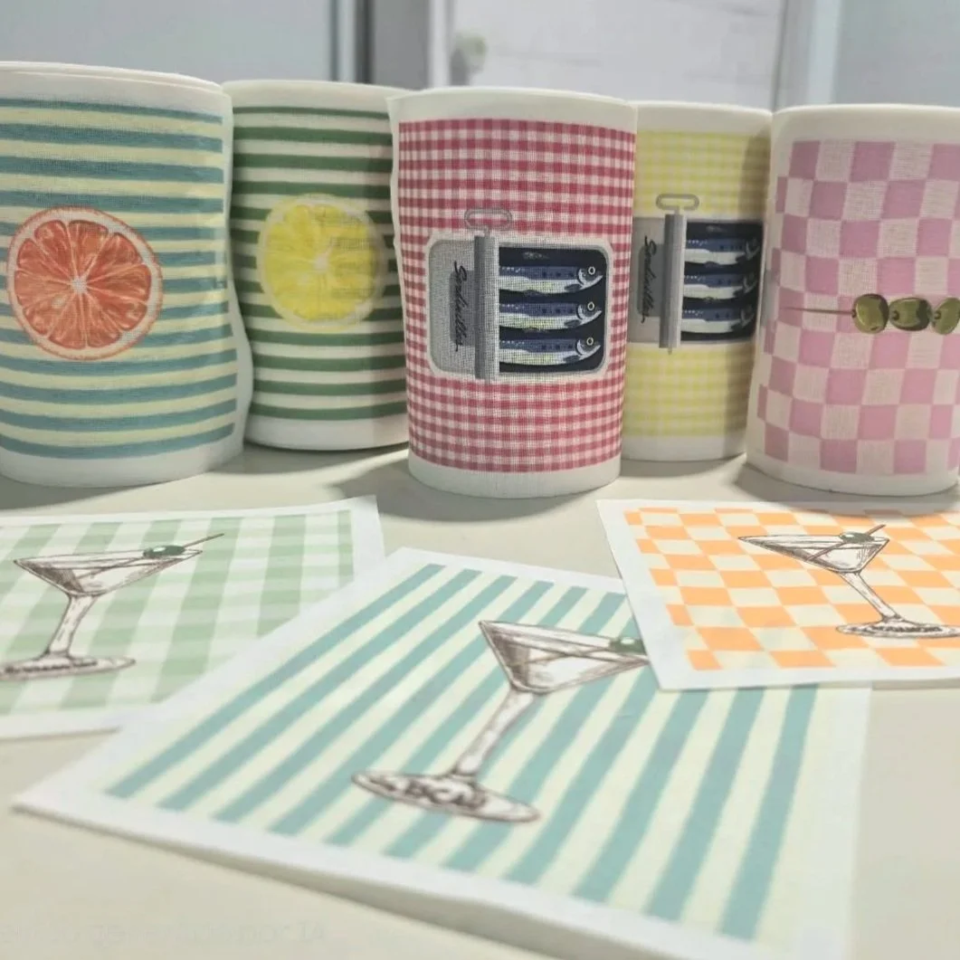
Few companies can trace their roots back more than a century and still count themselves among their industry's innovators. Texia, headquartered in Monistrol de Montserrat, Spain, is one of them.
But the story of Texia is not simply one of longevity.
It is a story of continual reinvention. As the textile industry has grown more global and competitive, Texia has repeatedly reshaped its business, investing in technology, developing its own brands, and placing sustainability at the centre of its mission. In doing so, it offers a compelling example of how a heritage manufacturer can lead rather than follow through a period of profound industry change. Image Credit: Texia
What are we craving Ultimately?
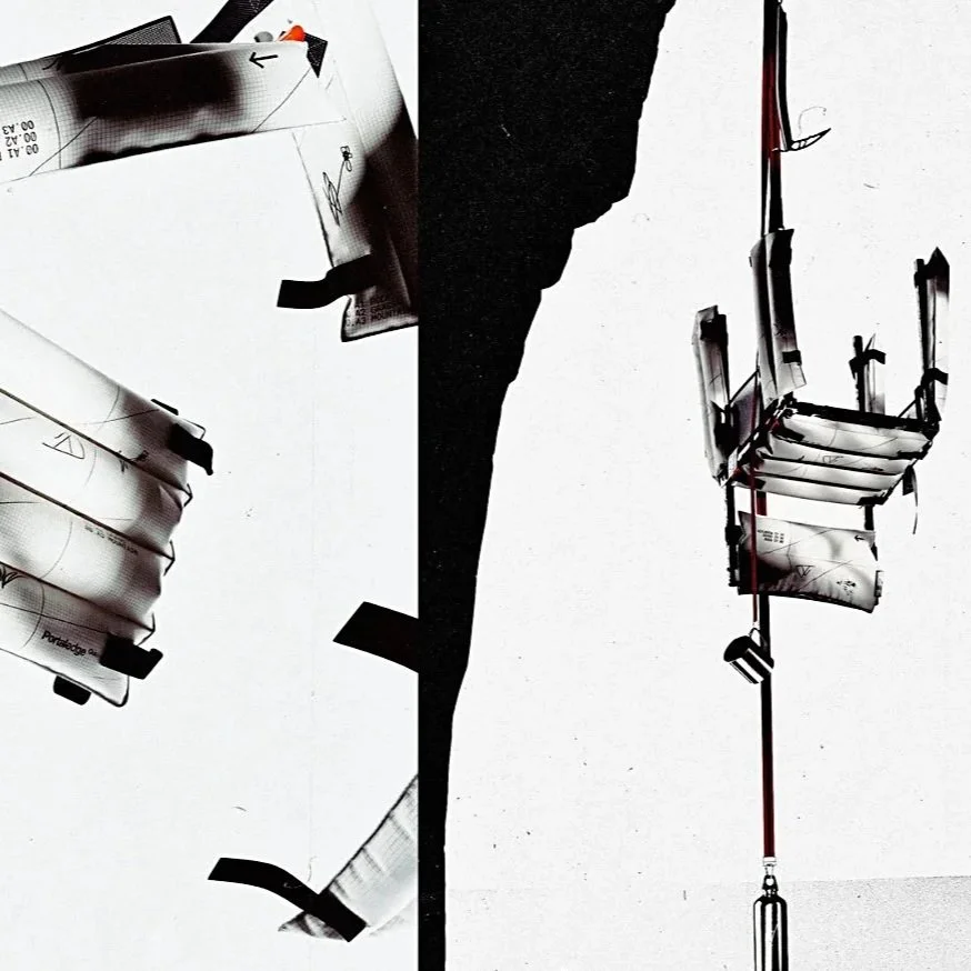
The instinct to slow down while simultaneously optimising every measurable aspect of life isn't a passing curiosity. It's a structural response to a world that feels increasingly unstable, and it's reshaping what people expect from their homes, hotels, workplaces and healthcare environments alike.
For the design and manufacturing sectors, this means rethinking both product and process.
The Structual Shift is Real and its Already Here
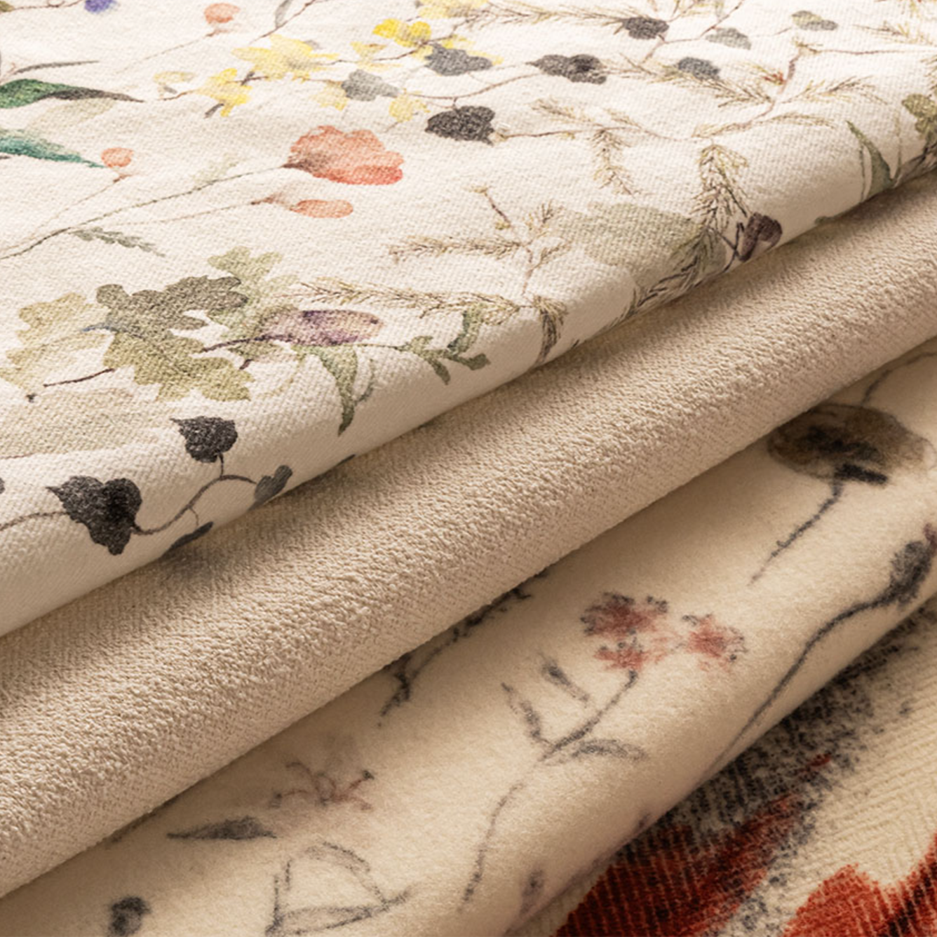
Volumes are moving east, where digital production is accelerating rapidly. Consumer behaviour has shifted.
Demand is now driven by personalisation, shorter buying cycles, and an expectation of near-instant responsiveness. Regulatory pressure is intensifying, with supply chain transparency now a legal and commercial fact in many markets. And margins? They are under sustained, structural pressure.
This is not a temporary disruption. It is a fundamental reordering of how textile manufacturing must operate.

The Challenge: Standing Firm as the Industry Shifts
The wallpaper landscape has changed dramatically. Digital printing has lowered the barrier to entry, spawning countless direct-to-consumer brands and pushing much of the market towards faster, cheaper production.
At the same time, manufacturing in the UK has grown steadily harder - rising minimum wage, national insurance, energy and substrate costs all bear down on margins. Surface Print have embraced all of these challenges - and stand resolutely prepared for the future.
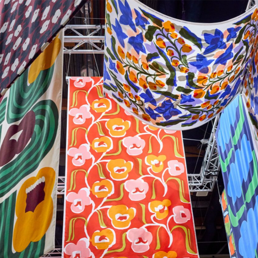
From Helsinki's printing mill to Paris's Le Marais, discover how Marimekko is scaling a design-led brand with purpose, craft, and bold innovation.
But what makes Marimekko's story compelling is not just its aesthetic legacy?

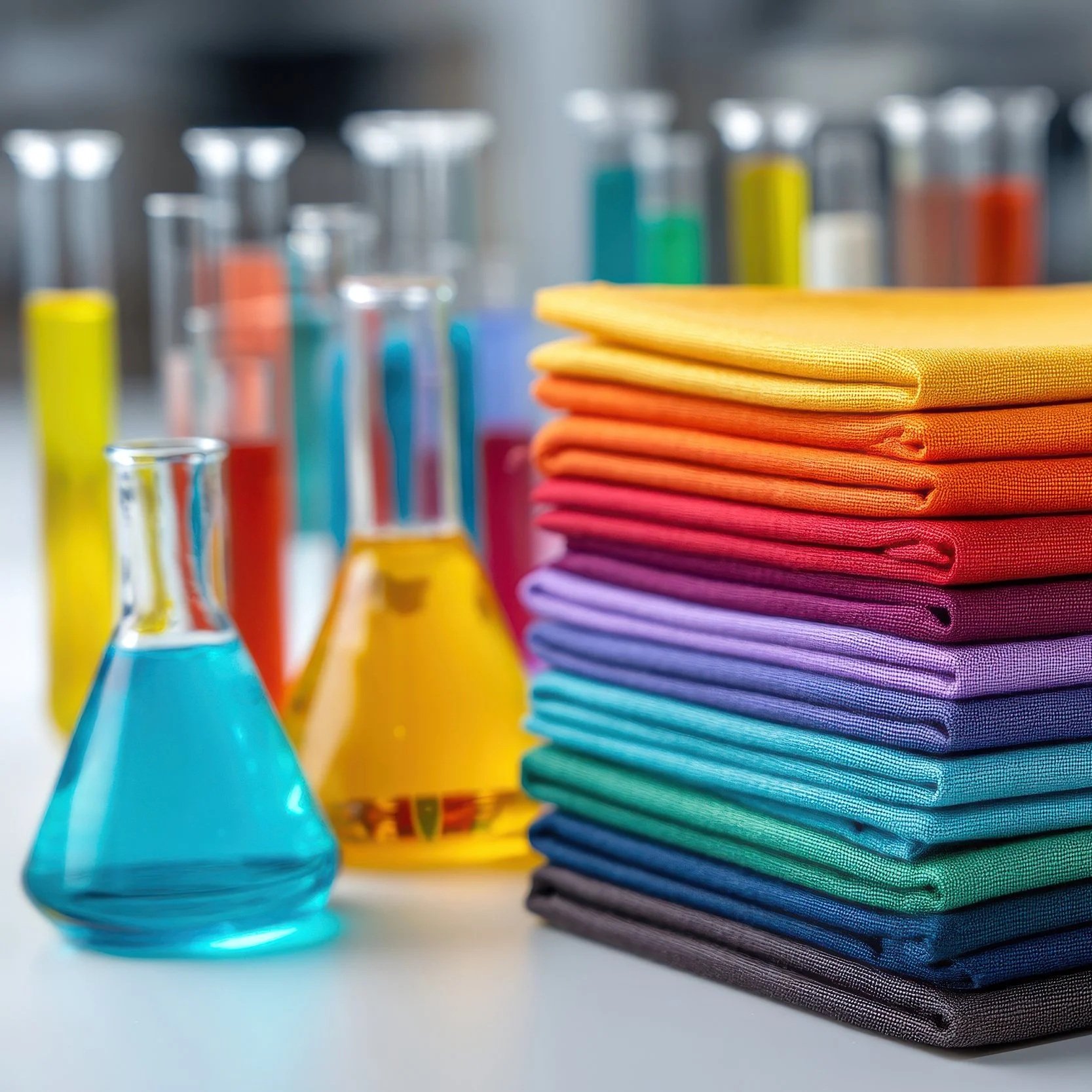
The word "toxic" carries weight. It conjures danger, harm, and things best avoided.
“Yet in the textile industry - Where between 3,000 and 10,000 chemicals move through the supply chain, a reflexive fear of the term is one of our biggest obstacles to progress.”
This article distils the key takeaways and what buyers, designers, and brands should be asking right now.
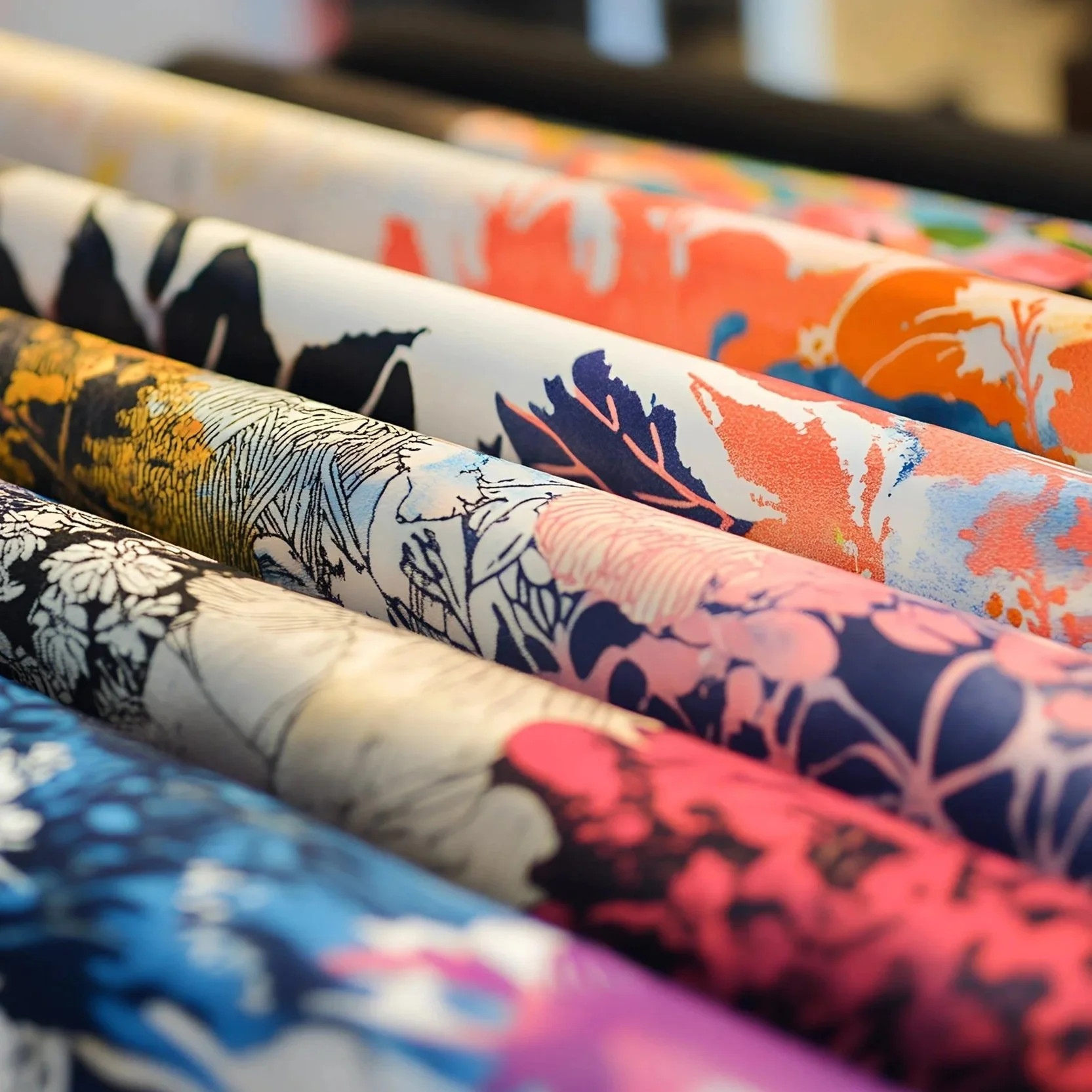
What Is the Digital Product Passport?
At its core, a Digital Product Passport is a digital record attached to a physical product - For a printed textile product, this means the DPP would capture data on the substrate, inks and dyes used, the printing process and technology, chemical compliance, environmental impact (including water and energy use), supply chain traceability, and end-of-life instructions.
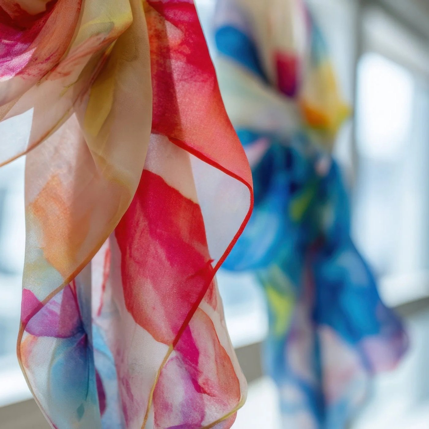
The Market Gap that Changed Everything
Future Fashion was founded in 2019, timed deliberately to coincide with a pivotal moment in global textile technology: the commercial launch of the EFI Reggiani BOLT Single-Pass digital printing system.
The founders recognised that single-pass architecture had fundamentally changed what was industrially possible - and that Pakistan's domestic market had yet to catch up.

Print is no longer defined by the inefficiencies that once characterised it…as advances in production processes and technology have significantly improved its environmental performance.
Taran Rai, Corporate Sustainability Manager at Epson explains why?
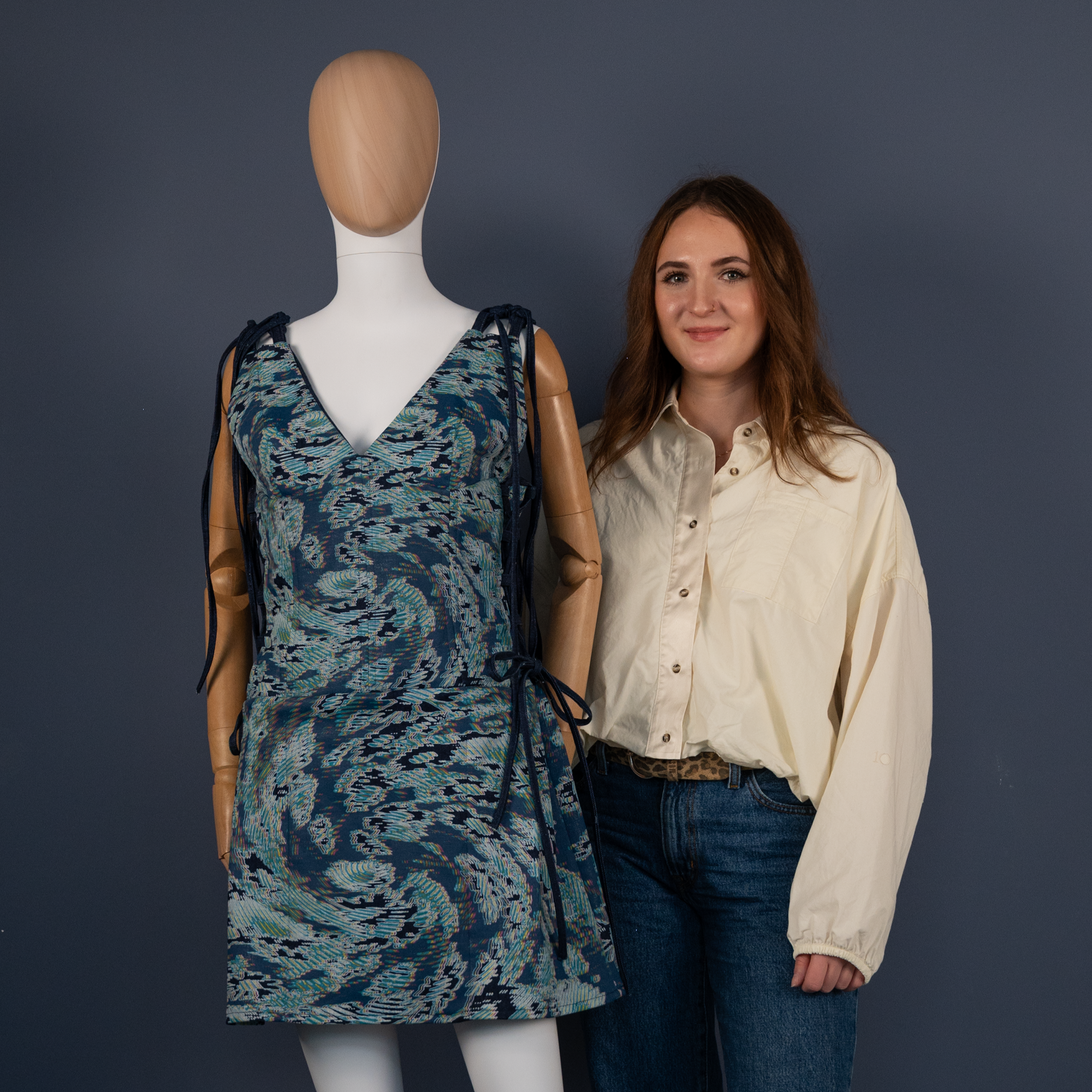
The story of what happens when young designers access digital technology is still being written.
What once was a theoretical sustainability goal seems to have shifted into an active regulatory reality.


Is the Textile Market Finally Recovering?
After a difficult few years, there are genuine reasons for optimism. Duncan was candid about the challenges: "The market for textiles has been very difficult over the last three years. I'm not going to hide the truth there. But the tide is turning.“
A profound shift is currently reshaping the sector
Changing consumer expectations demand greater design diversity, faster turnaround times, and sustainable manufacturing practices.
To thrive, interior brands must adapt their supply chains, bringing production closer to the end consumer and moving away from bulk manufacturing.
Digital textile printing offers a definitive solution to these operational bottlenecks.

Digital transformation doesn't announce itself.
It accumulates - one innovation at a time - until an entire industry looks back and realises the ground has shifted beneath its feet. That's precisely where textiles stands today.
The conversations happening now about AI, automation, sustainability, and digital product passports are not theoretical. They are shaping decisions being made on factory floors and in boardrooms right now.

“By leveraging advanced digital textile printing, Marylene Madou has successfully merged traditional craftsmanship with cutting-edge technology. Her approach offers a blueprint for how independent designers can scale their brands globally while maintaining a minimal environmental footprint.”
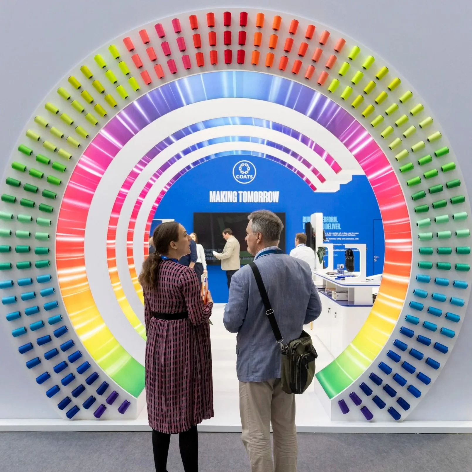
The textile industry is undergoing a vital transformation. As the insights from Techtextil and Texprocess reveal, the path forward relies on a combination of sustainable hardware, intelligent chemistry, and seamless digital workflows.
From Zimmer's industrial-scale energy reductions and Stratasys's on-demand 3D embellishments, to Kornit's single-step technical printing and the unified digital ecosystems of NedGraphics and Optitex, the tools for change are here. To stay competitive, brands and manufacturers must adopt these innovations, moving away from fragmented, wasteful processes towards a truly connected, circular economy.
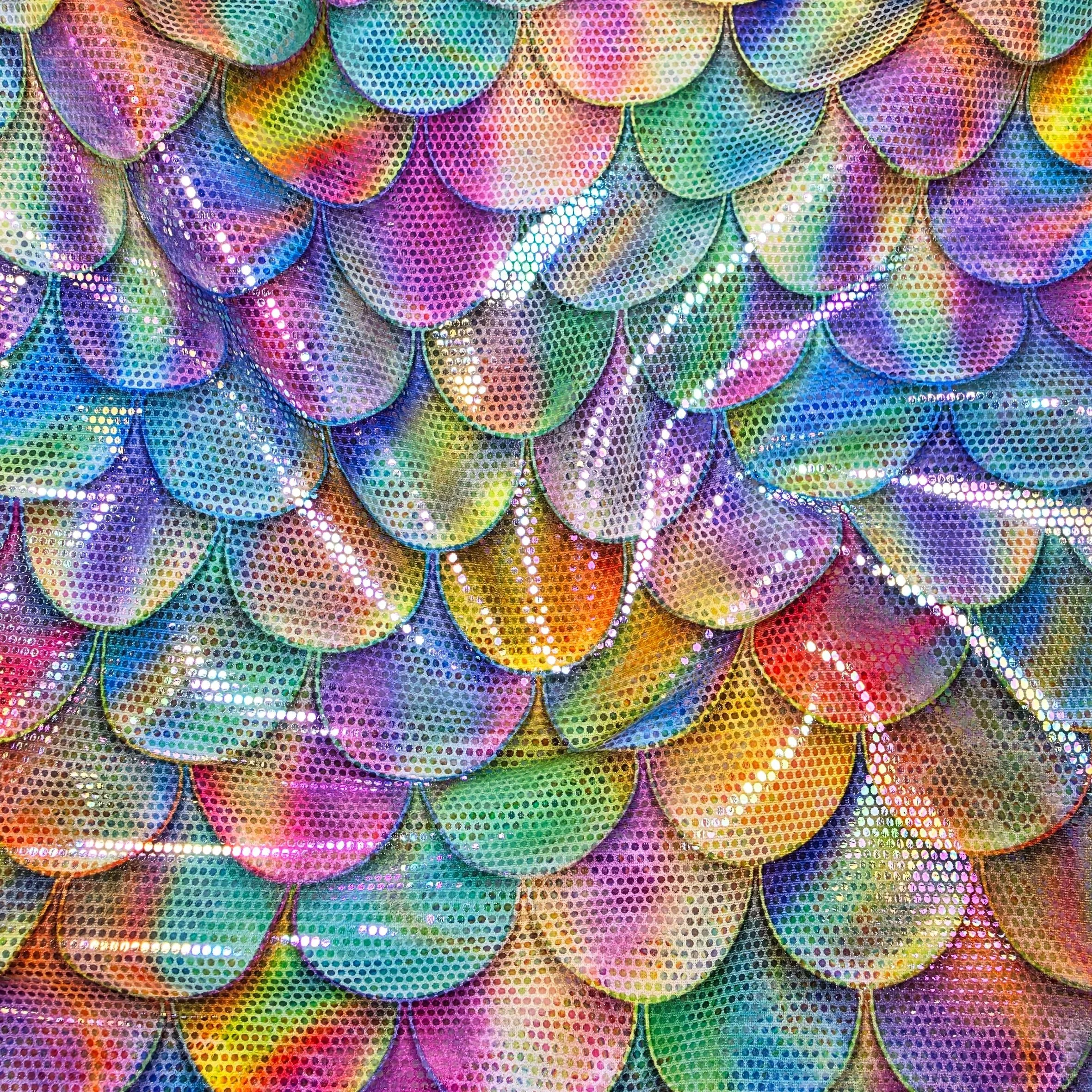
Friedmans stands as a testament to the power of combining traditional textile knowledge with forward-thinking innovation.
“Operating from their UK headquarters, Friedmans now serves a diverse array of sectors, including swimwear, dance, entertainment, sportswear, interior decor, prosthetics, and even pet apparel. With a strategic supply chain that reliably serves clients worldwide”
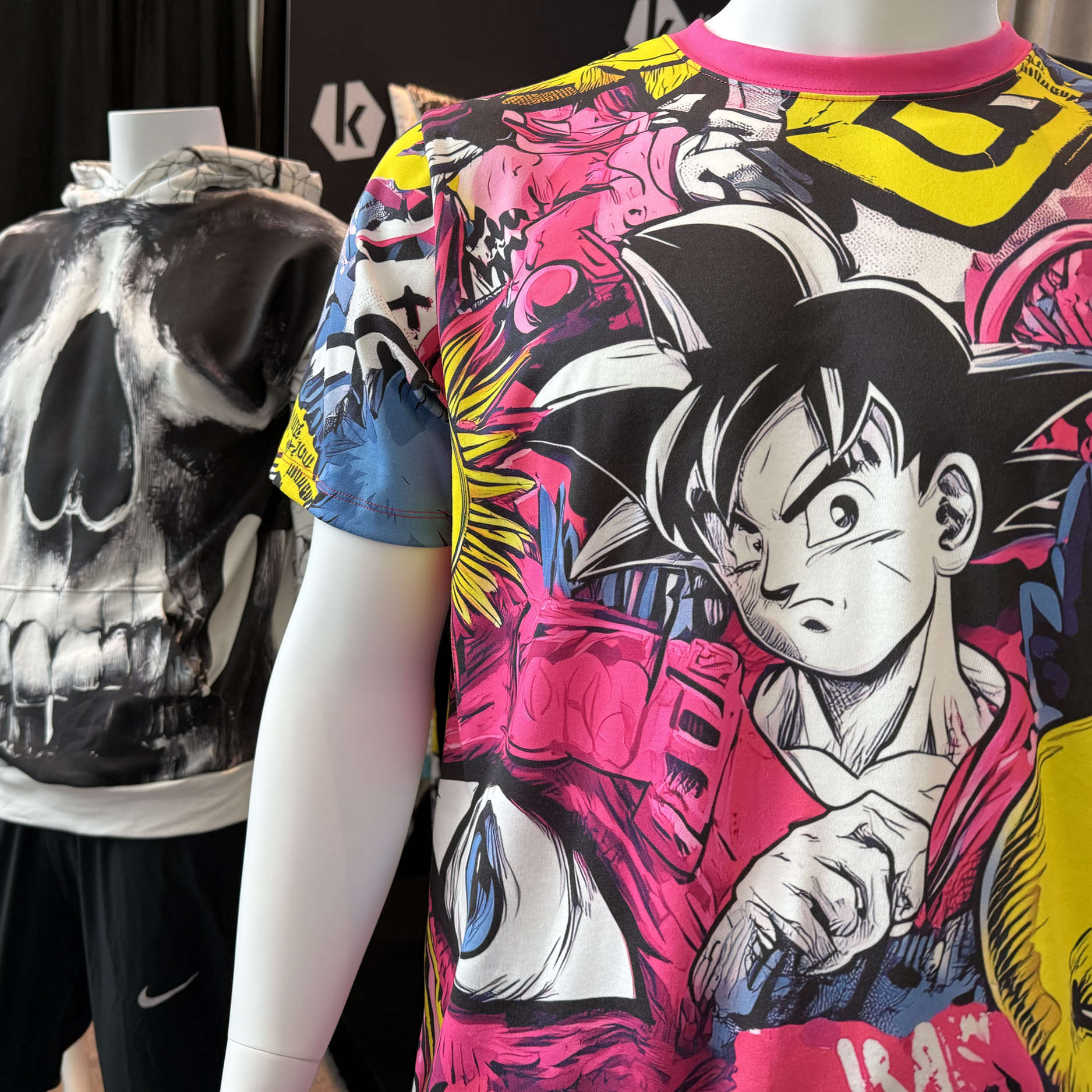
The apparel decoration industry is decisively moving away from isolated, analogue production tools toward connected digital manufacturing environments.
"Kornit’s unwavering commitment to transformative technology continues to disrupt the status quo. For business leaders and innovators ready to capture the future of apparel manufacturing, the path forward is clear”
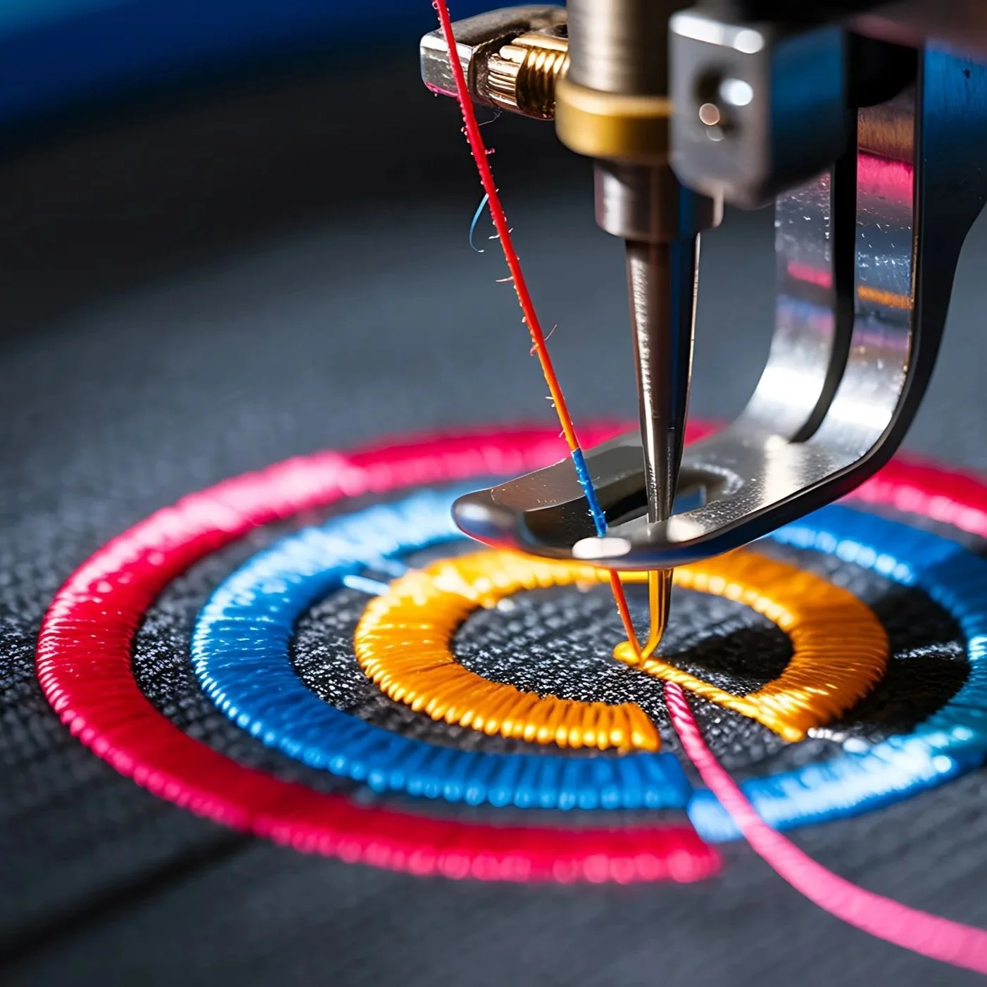
The Urgent Need for Sustainability at Scale
The transformation at Coats provides a vital blueprint for the wider textile and apparel sector. True sustainability cannot be achieved in silos. As Dearing emphasised:
“Cross-industry collaboration is the engine of meaningful change. Brands, machinery suppliers, chemical providers, and fibre producers must act as an interconnected ecosystem”
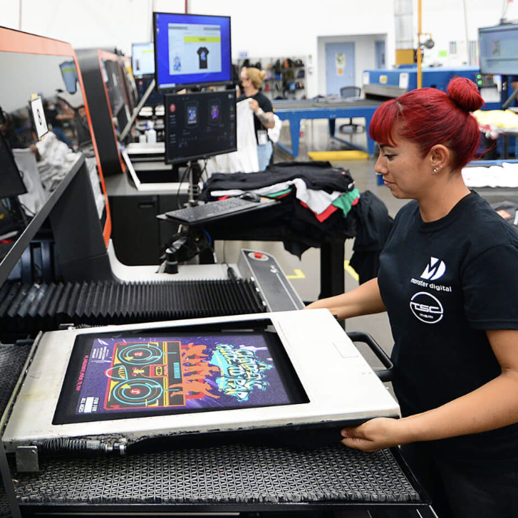
Today’s customers demand superior product quality, real-time data visibility, and lightning-fast turnaround times.
For large-scale garment decorators, managing these expectations while balancing seasonal demand fluctuations - such as the massive surges seen during Black Friday - presents a monumental challenge.
"Relying on transactional vendor relationships and outdated legacy equipment is no longer sufficient to secure long-term stability and growth.”

Printing method is never a secondary detail. It shapes the entire life cycle of a product, from concept to customer. In today’s fashion industry, where margins are tighter and speed matters more than ever, technical knowledge has become a competitive advantage.
“The future of textile design belongs to professionals who can combine creativity with execution, aesthetics with practicality, and vision with production reality”.

September 2026 - Epson today announces the SureColor SC-F300, a new A3 dye-sublimation printer designed to help small businesses and growing personalisation providers produce professional-quality output with a compact, user-friendly workflow.
The SC-F300 is positioned to help users broaden their product offering – supporting expansion from A4 into

Mortsel – Belgium – September 2026– Agfa has today announced the launch of the Jeti Tauro H3300 HS, a new hybrid UV LED inkjet press that extends its award-winning Tauro family.
Built on technology and insights gathered across the entire Tauro range, the new press is designed to meet the productivity demands of today's print service providers while offering a clear path for future growth.

Summa announces the expansion of its F Series Vantage platform into large-format production environments with the introduction of the F1832, F3220 and F3232.
Designed for high-volume signage, packaging, textile, and industrial applications, the new models extend the philosophy behind the F Series Vantage: delivering productivity gains across the entire workflow.
Alongside the new large-format models, Summa also introduces the F1625CF, a dedicated configuration optimised for dry carbon fibre cutting
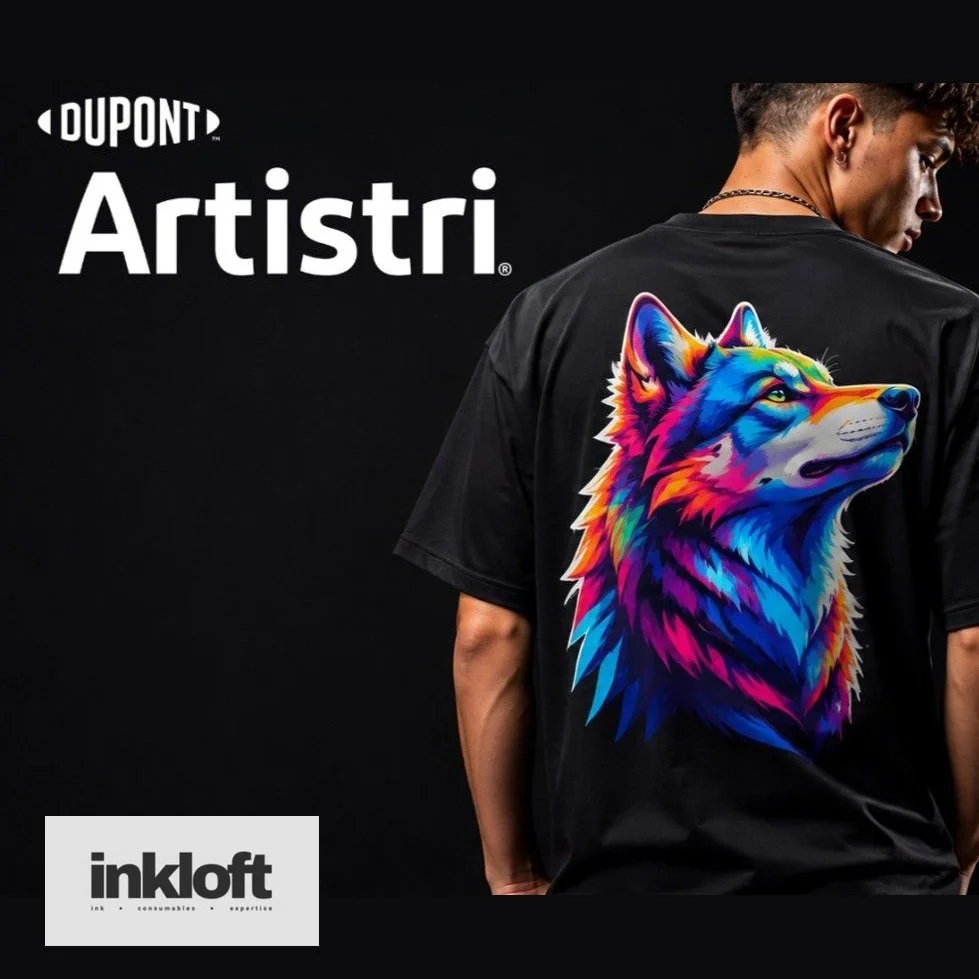
United Kingdom – September 2026 – Inkloft, a new specialist digital printing business founded by Gary Weyman and Andy Hancock, has announced its entry into the direct-to-film (DTF) market.
The company has been appointed as a distributor of DuPont™ Artistri® DTF products, including P1600 inks and Artistri Jettable Adhesive JA1100, both now available to purchase online through inkloft.co.uk.

Tokyo, Japan – September 2026 – Seiko Epson Corporation today announced the launch of CONTOURJET, a new brand for its Direct-to-Shape Printing System, combining Epson's proprietary inkjet and robotics technologies to meet the growing global demand for decorating complex three-dimensional objects.
Under the CONTOURJET brand, Epson will deliver a total solution encompassing enhanced system performance, inks, related software, implementation support, and maintenance services.
The offering is designed to help customers improve efficiency in decoration processes, reduce environmental impact, and unlock a wider range of creative designs.

LAS VEGAS, NV. September 15, 2026 – Fiery, LLC, the print industry’s leading innovator of digital front ends (DFEs) and workflow software, today announced it is showcasing an end-to-end portfolio of solutions that power all corners of the digital print room at PRINTING United 2026 in Las Vegas, Nevada.
Fiery’s award-winning products power printing’s broadest range of applications, including commercial print, large format, industrial inkjet, direct-to-film, direct-to-garment, and more.
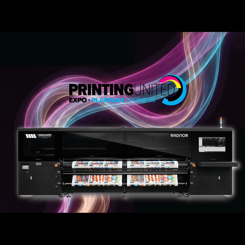
Franklin, TN – September 2026: Vanguard Digital Printing Systems, a Durst Group Company, returns to the PRINTING United Expo with a lineup that reflects the fast moving, boundary pushing, revolutionary company it has become.
In booth C1514, visitors will experience Vanguard’s proven technology, continued innovation and an all-new solution that will change the way print formed service providers think about production.

Birmingham, UK – September 2026 – Perfect Colours has announced its participation in The Print Show 2026, taking place at the NEC Birmingham from 29th September to 1st October.
The company will be offering bespoke, hands-on demonstrations of the Canon UK Colorado M5W, giving visitors the opportunity to witness the technology firsthand and explore how it can transform their production capabilities.

Leicester – UK = September 2026– Vivid Laminating Technologies Ltd, a leading innovator in finishing technology, has announced that its award-winning Veloblade Nexus has been selected by 5 Studio UK, a specialist in large-format print and exhibition stand production, to support the creation of high-quality exhibition stands.
The Veloblade Nexus was chosen for its precision etching and engraving capabilities, which allow 5 Studio UK to deliver premium wood-finished displays for clients across the UK, Europe, and beyond.
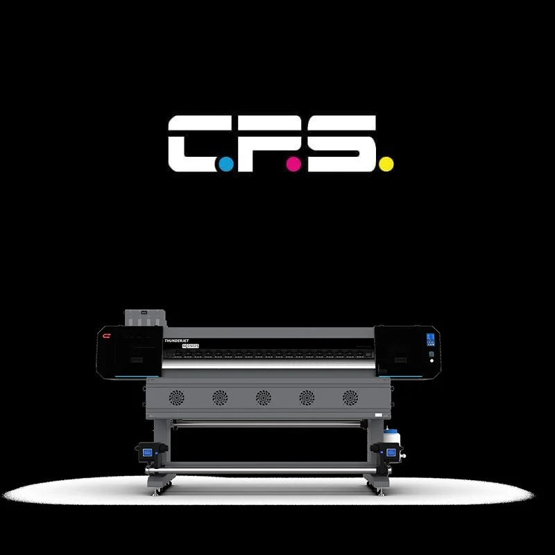
Telford, UK – September 2026 – China Print Supplies UK Ltd will unveil the Gongzheng ThunderJet AQ1602S at The Sign Show, offering visitors a hands-on demonstration of its latest entry-level eco-solvent printer at stand S220 + S240.
The ThunderJet AQ1602S is a professional 1.6m eco-solvent printer engineered for high-quality signage, graphics, and display production

Reading, UK – 15 September 2026 – HP has announced it will showcase four machines from its HP Latex portfolio, alongside the HP DesignJet Z9+ and HP PrintOS Production Hub, at The Print Show and The Sign Show 2026.
Taking place from 29 September to 1 October in Hall 1 of the NEC Birmingham, the event will feature live demonstrations and application examples highlighting opportunities across sign-making and wide-format print.

Paris - France – September 15th 2026 – Optitex, a global leader in fashion technology, has today announced the release of O/26.1, the latest evolution of its industry-leading software suite.
The update strengthens the tools that fashion and apparel businesses rely on daily, introducing enhanced pattern design capabilities, more flexible cut planning, and a smoother, more connected cloud experience through OPTINEDCloud, formerly known as O/Cloud.
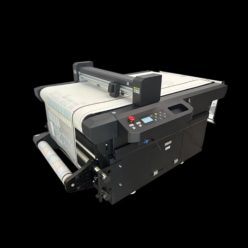
Clay Cross – September 2026 – Resolute DTF has confirmed it will unveil its latest range of digital cutting solutions at The Print Show 2026, held at the NEC Birmingham from 29 September to 1 October.
The announcement reflects the company's continued commitment to advancing production efficiency across the DTF, vinyl, UV DTF transfer and label sectors.
Visitors to Stand P610 will be given a first-hand look at three cutting systems designed to address the industry's growing demand for accuracy, flexibility and streamlined workflows.

Hamamatsu, Japan – September, 2026 – Roland DG, a leading manufacturer of wide-format digital printing solutions, has announced the launch of the TrueVis MG2 Series, a next-generation UV printer/cutter range comprising the MG2-640 and MG2-300.
Designed to help print businesses increase profitability, the new series combines significantly higher productivity, exceptional print quality, advanced application capabilities and lower running costs in a single integrated UV Print & Cut solution.

September 2026 – Georg+Otto Friedrich GmbH, a fourth-generation German textile manufacturer, today announced its participation in PRINTING United Expo 2026, North America's largest gathering of the print industry.
The company will exhibit at Booth C1996 from 23–25 September 2026 at the Las Vegas Convention Center.
The expo represents a pivotal opportunity for Georg+Otto Friedrich to demonstrate how warp-knitted polyester is reshaping the possibilities of digital printing.
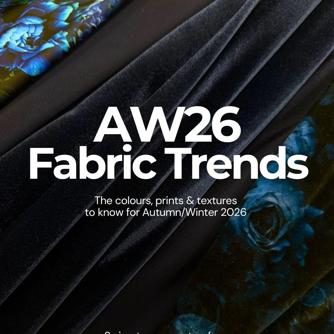
Altrincham – Cheshire – Funki Fabrics has today released its Autumn/Winter 2026 fabric trend report, identifying four key directions set to define the season: warm neutrals, deep jewel tones, vampy cherry reds and dark, moody botanicals.
The report offers designers across dancewear, performance wear, costume and beyond a clear framework for translating seasonal colour and print movements into fabric choices.
According to Funki Fabrics, AW26 marks a decisive shift towards richer, more dramatic palettes.
Cool creams and pale beiges are giving way to toasted beige, camel and biscuit browns, offering warmth and versatility as either standalone tones or a base for bolder accents.

Colombo, Sri Lanka – September 2026 – Winterquilts (Pvt) Ltd., one of Sri Lanka's leading garment manufacturers and exporters, has invested in Coats Digital's award-winning GSDCost solution together with its newly launched AI-powered GSDQuest platform.
The move is designed to standardise garment costing, improve costing accuracy and accelerate Bill of Labour generation across the company's manufacturing operations.
London, UK – September 2026 – The Only Natural International Student Design Competition 2026, supported by Artsthread, has revealed its Category and People's Choice winners.
Selected from an exceptional field of entries from student designers across the globe, this year's winning projects span Fashion and Home, showcasing outstanding creativity, craftsmanship and innovation in the use of natural materials.

Bressanone – September 2026 – Durst Graphics today features its P5 350 CORE, a new 3.5-metre hybrid printing platform designed to serve as an accessible entry point into the wider Durst Ecosystem.
The system brings together proven technologies from across the P5 portfolio, offering print businesses a reliable and future-ready first step into industrial digital printing.
This machine reflects Durst's continued commitment to lowering the barrier to entry for print operators seeking dependable, scalable technology without compromising on quality or performance.

Peterborough -September 2026 – Snuggle, a leading trade fulfilment provider, has today announced it is the first company in Europe to install three Epson G9000 DTF systems, marking a significant expansion of its production capacity to meet surging demand from trade customers across the UK and Europe.
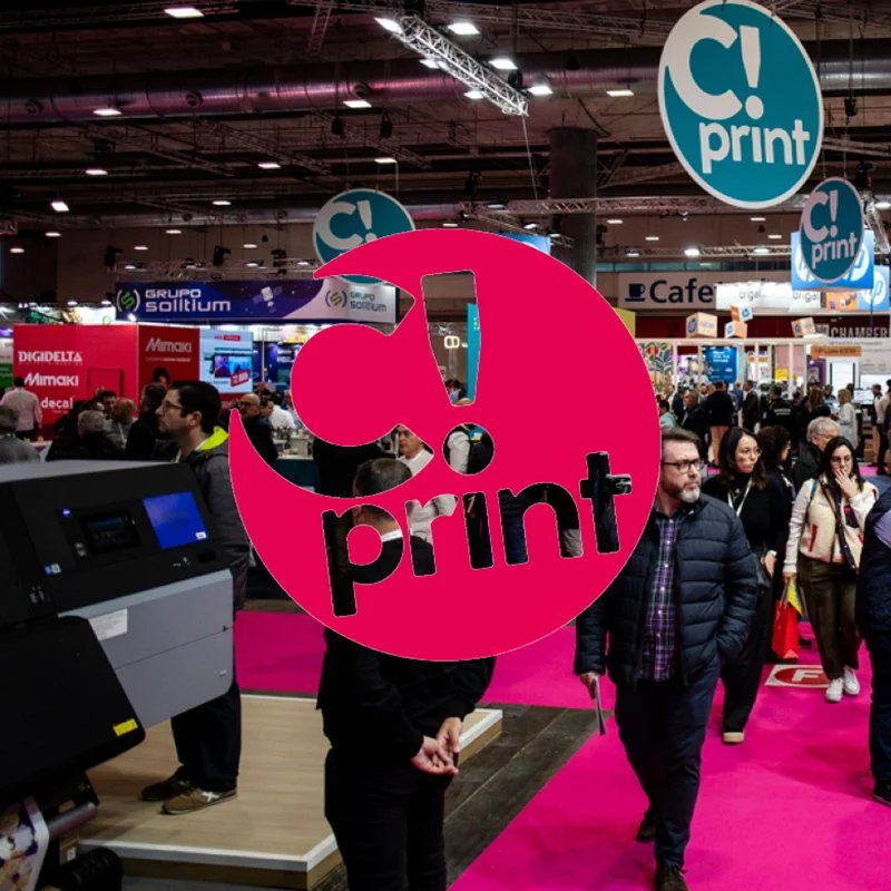
The graphic industry is changing at high speed. Automation, artificial intelligence, personalization, new materials and sustainability are transforming the way products are made while, at the same time, opening up new business opportunities for professionals in the sector.
Against this backdrop, C!Print Madrid 2027 will bring together manufacturers, distributors, printers and professionals from the printing and visual communication world at IFEMA MADRID from January 12 to 14, showcasing the technologies and trends driving this evolution.
This eleventh edition arrives with a strong market response: 90% of its more than 7,000 m² of exhibition space is already booked, with leading companies in the sector such as HP, Epson, Fujifilm, Roland DG, Mimaki, Digidelta and Konica Minolta, among others
Las Vegas – Nevada – September 2026 – BARBIERI electronics, a specialist in colour measurement technology, has announced its sponsorship of the G7+ Exchange, an industry gathering set to take place ahead of PRINTING United Expo 2026.
The event will bring together experts and professionals from across the printing sector to discuss advancements in colour management and print quality.
The G7+ Exchange will be held on 22 September 2026 at the Las Vegas Convention Center, Room N109, as part of the broader PRINTING United Expo.

FREMONT, CA. September, 2026– Fiery, LLC, the leading provider of digital front ends for the print industry, today announced it will host an exclusive webinar titled "Beyond CMYK: From more colours to more impact" on Tuesday, 6th October 2026 at 5:00pm CEST.
The 45-minute session will explore how commercial print businesses can move beyond the constraints of standard CMYK to unlock bolder colours, sharper precision, and stronger margins through expanded gamut printing.
As brands increasingly demand vibrant, exact colour matching, print providers who rely solely on standard CMYK risk falling behind.

London, UK – September 2026 – GREEN GRADS, the platform championing UK graduate eco-activists, will host a free hands-on workshop, Make Art from Waste, as part of the London Design Festival 2026.
Taking place on Monday, 14th September from 2-6pm at 21 Great Chapel Street, W1, the event invites participants to weave their own artwork from workplace textile waste, in partnership with the Surface Design Show.
Led by Green Grad and textile artist Claire Malley (@clairemalleyart), the workshop will guide attendees through the process of designing and weaving a unique piece using varied textile waste, including denim offcuts and recycled yarns.

LOS ALAMITOS, Calif. – September, 2026 – Epson will showcase its latest digital printing solutions at PRINTING United Expo 2026, the annual event bringing together the print industry to explore the latest innovations in commercial, apparel, packaging, wide-format and specialty printing.
Taking place Sept. 23-25 at the Las Vegas Convention Center in Las Vegas, Nevada, Epson will introduce new solutions for textile applications and showcase its extensive portfolio of commercial, industrial and business inkjet solutions.
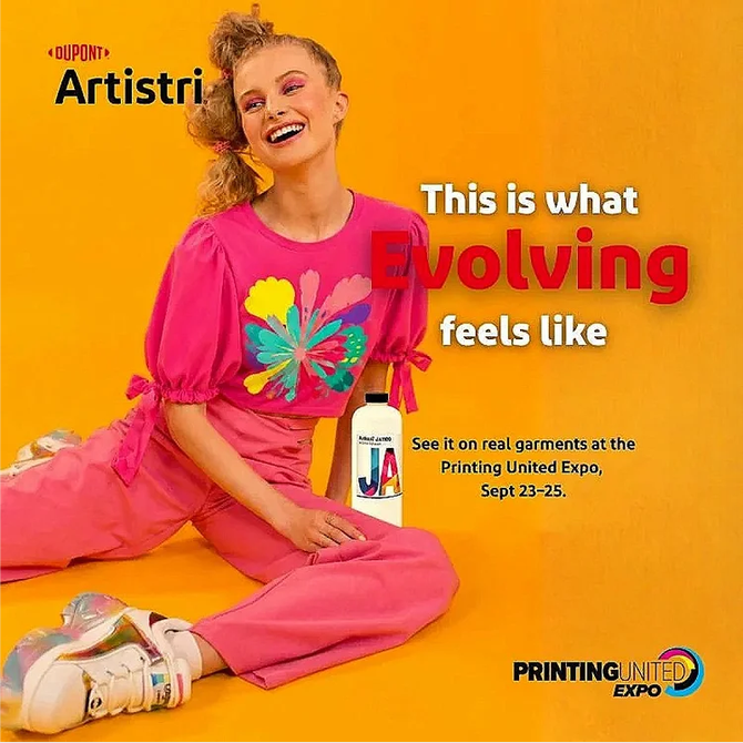
Wilmington, Delaware – September 2026 – DuPont™ Artistri® Digital Printing Solutions today announced it will demonstrate fully automated direct-to-film (DTF) production live at its booth during the upcoming PRINTING United Expo.
Visitors will witness two Brown Manufacturing Group, Inc. automation lines running the complete DTF process from start to finish, offering a first-hand look at the technology reshaping the future of textile printing

Roland DG Europe has announced its renewed presence at Viscom 2026, the leading international exhibition for the visual communication industry.
The company will use the event as a platform to reinforce its position as an industry leader, while continuing to drive innovation and improvement across the sector.
Viscom 2026 will take place on 28th and 29th October at Allianz MiCo Milano, bringing together exhibitors, innovators, and decision-makers from across the visual communication landscape.r

Agfa will return to The Print Show for the third consecutive year, reinforcing its commitment to the UK print and signage market.
The event takes place at the NEC Birmingham from 29 September to 1 October 2026, with Agfa welcoming visitors to stand P510 in Hall 1.
This year, Agfa is bringing print technology, workflow software and real-world applications together to demonstrate a complete wide-format production environment.

Telford – UK – September 2026 – The Dlican DLI-360s from China print Supplies has probed to be an excellent investment for Promo Trade Print where it will be helping them meet the demand for personalised drinkware!
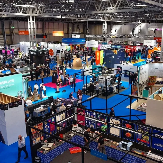
At The Print Show. from 29th September – 1 October 2026, CMYUK will launch its new Sign & Graphics Materials portfolio, bringing together a practical, commercially focused range of substrates for everyday display graphics, signage, décor and specialist print applications.
The new collection has been developed with a clear objective: to give customers a focused, reliable range of materials that covers their everyday application requirements, while removing unnecessary complexity from the product portfolio