Shutterstock Analysed Their Customer Download Pixel Data To Produce Their Trend Colour Forecast For 2020

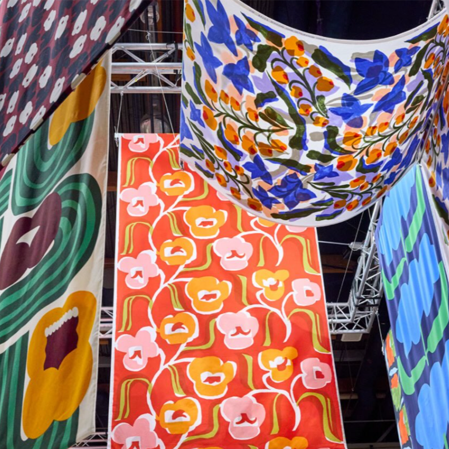
Image Courtesy of Shutterstock

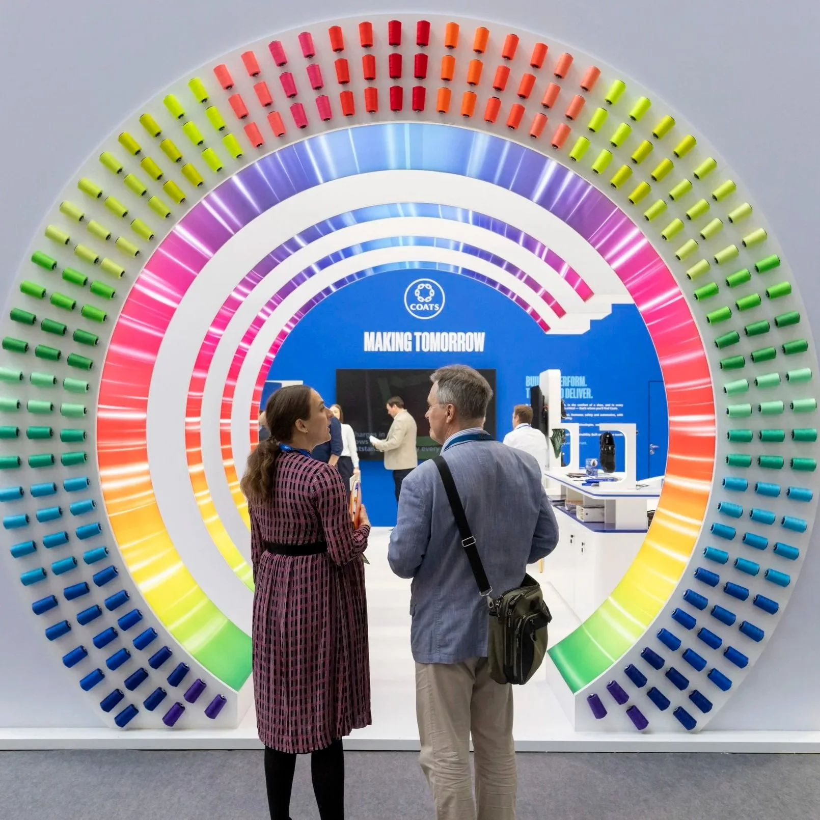
Image Courtesy of Shutterstock

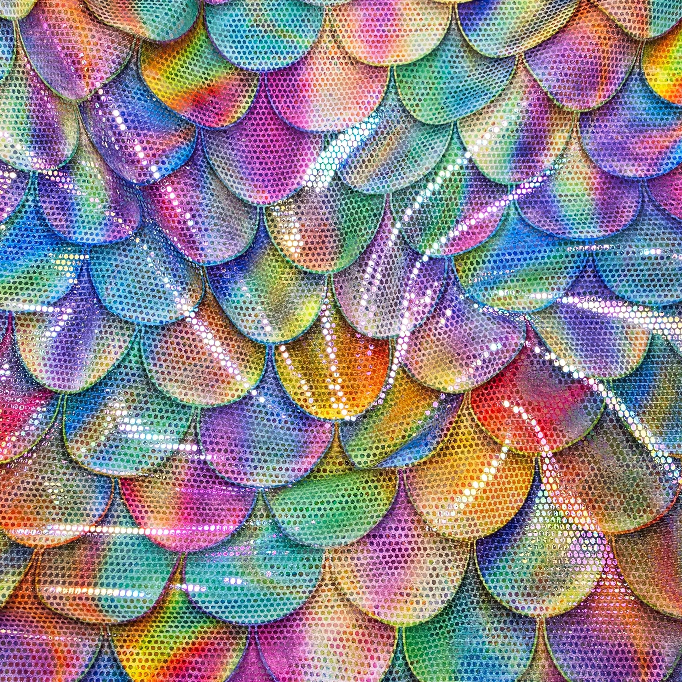
Image Courtesy of Shutterstock
The role colour plays in our visual world is so absolute that its power is hard to overestimate.
As an enterprise driven by creativity, Shutterstock appreciates how intrinsic colour is to design, marketing, messaging, and everything in-between.
Colour is a simple, yet powerful form of messaging. It portrays a wide range of emotions without so much as a word or image.
Colour can highlight something important or just as easily disguise something insignificant. It can invoke the past, inform the present, and inspire the future.
To discover exactly which colours are on the rise, Shutterstock sorted through their customer downloads and analyzed hundreds of billions of pixel data from all those images.
Shutterstock then mapped each pixel to their closest named hex code and deduced which colours had the greatest growth between last year and this year to give you their 2020 Color Trends.
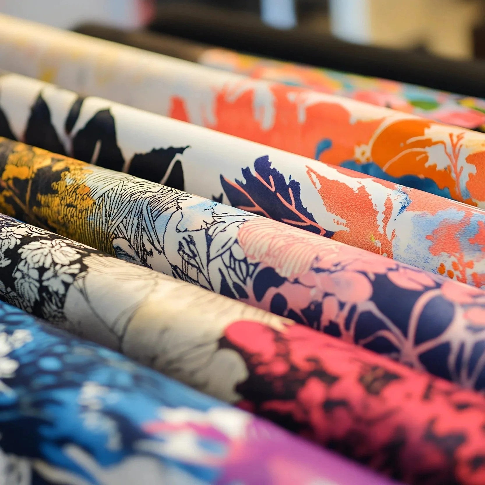
So Shutterstock invite the reader to discover Lush Lava, Aqua Menthe, and Phantom Blue—three shades that will dominate 2020 and showcase the trend towards maximalism and saturated hues.
Whether it’s a response to the minimalist obsession of recent years or a collective desire for self-expression, the idea that more is more has climbed to new heights.
From fashion to fine arts, Shuttertock hve been seeing a shift from soft pastel colours to more sensational shades.
Lavenders, tans, whites, and pinks are becoming passé while these three bold, saturated hues are on their way to fame in 2020.
Lush Lava :
Like its namesake, this bold and fiery orange-red can’t help but demand attention.
It’s a radiant blend of blazing orange and rich red, two hues that are eye-catching in their own right.
From the brilliant glow of a stunning sunset to the burning embers of a roaring fireplace, this vibrant hue isn’t afraid to confidently stand out in a crowd.
In practical use, this exciting colour easily catches the eye—a perfect tool for companies looking to immediately draw attention to their branding.
Culturally, this shade represents happiness, love, and good health in Asian countries—something to keep in mind when communicating with that audience.
Aqua-Menthe
Rooted in its sparkling semi-precious origins and reminiscent of luxurious, ocean-front shorelines, this bright hue evokes ‘look at me now’ in a decidedly calm way.
Aqua Menthe is a mix of cyan and mint—two colours that are individually pleasing to the eye but together become an even more stunning shade.
It fondly brings to mind summer vacations and the crystal-clear waters of Bora Bora.
The bright, yet serene tone is perfect for conveying a playful, modern, and outgoing personality.
Whether used as an accent or as a main colour, it’s an excellent choice for fun and contemporary brands.
In the islands of the Caribbean, people love to splash this tropical shade across houses and buildings to create an uplifting landscape.
Phantom Blue
Famously used in van Gogh’s Starry Night, this deep saturated indigo-navy perfectly illustrated the dramatic skies around a glowing moon.
Today, it makes just as striking a statement with its sophisticated allure.
Whether in the exaggerated shadows of a popular nightclub or a new pair of dark denim jeans, this shade mesmerizes the eye with its rich depth.
Darker tones communicate stability, trustworthiness, and sophistication—and Phantom Blue is no exception.
While it’s striking on its own, it’s also the perfect companion for pops of bright, contrasting colours such as the aforementioned Lush Lava and Aqua Menthe.
This versatility hasn’t escaped creatives in Australia, Germany, and Spain, where its popularity is booming.