RIP TECHNOLOGY - COLORIMETRY AND COLOR MANAGEMENT IN DIGITAL TEXTILE PRINTING

Software and workflow topics are often under represented in the machine-dominated textile industry, but they have a critical influence on quality and profitability. Professional color management, for example, enables technology-agnostic printing of textiles or networked printing across remote locations.
GUEST ARTICLE: WRITTEN BY OLIVER LUEDTKE - COLORGATE
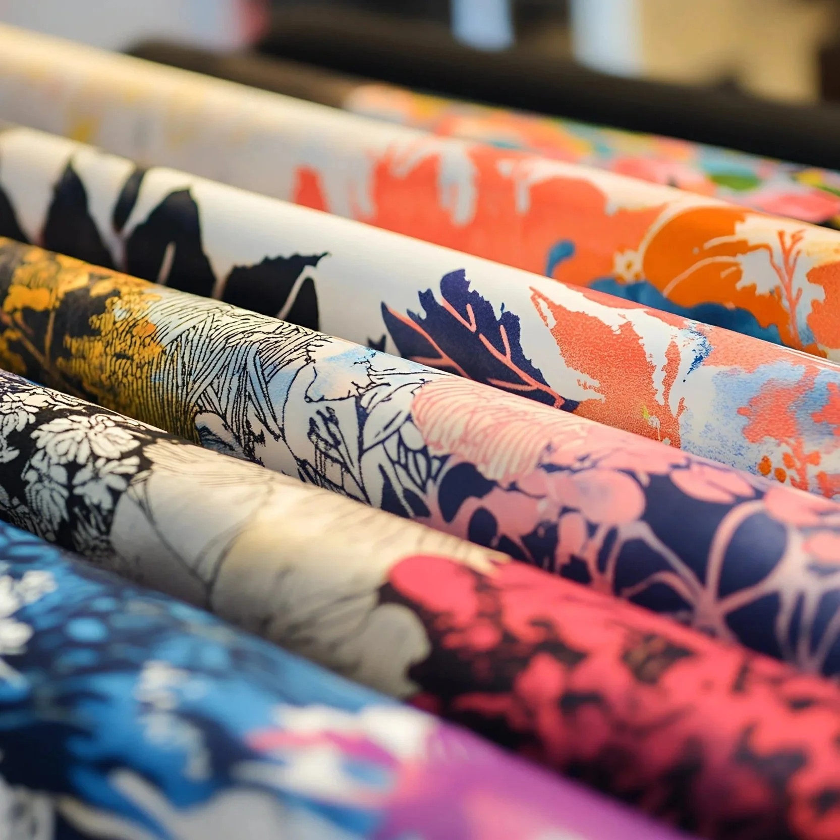
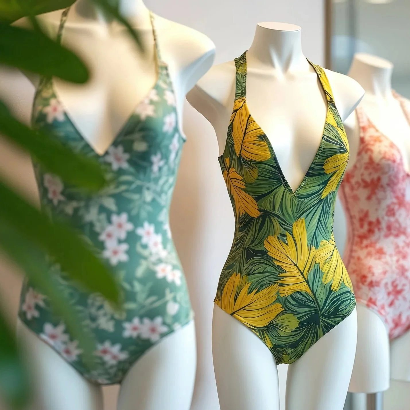
Inkjet printing on textiles has many advantages: there is no need to make printing forms or screens, which makes the process ideal for smaller runs and enables the economic production of personalized and individualized prints. Inkjet-based processes are also preferred for printing photographic images. However, there are also some challenges to be mastered: on the one hand, ink is absorbed by fabrics, so the textile or fabric must first be pre-treated. The different types of fibers, dyeing techniques and finishings of the base material provide a wealth of changing parameters as well.
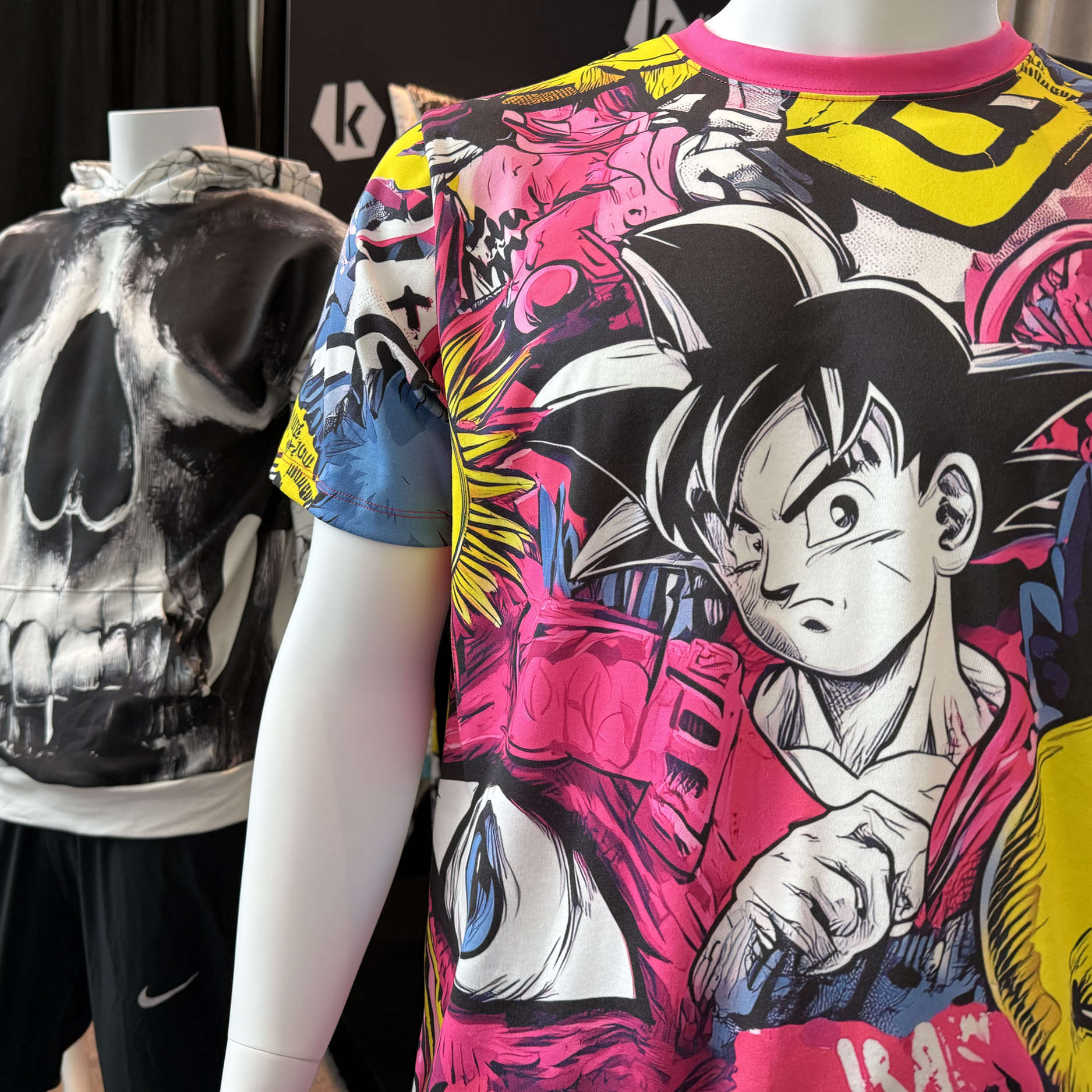
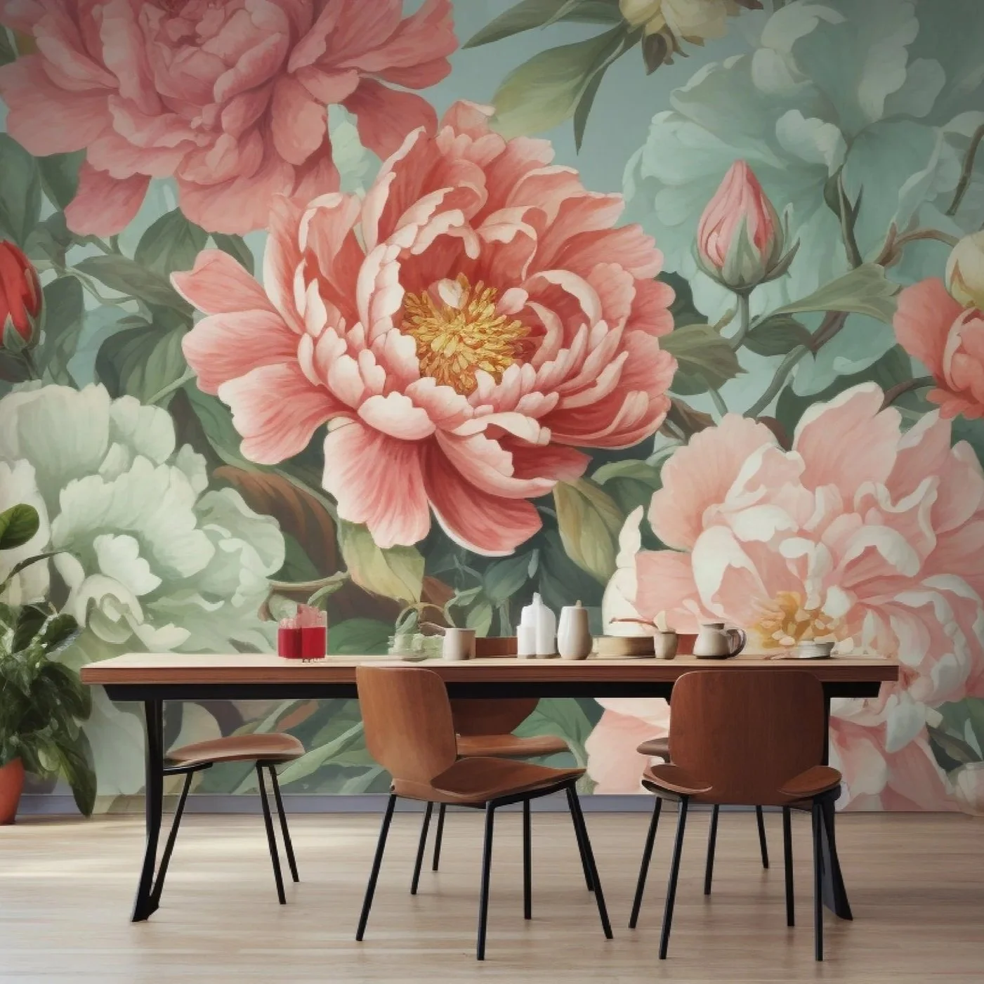
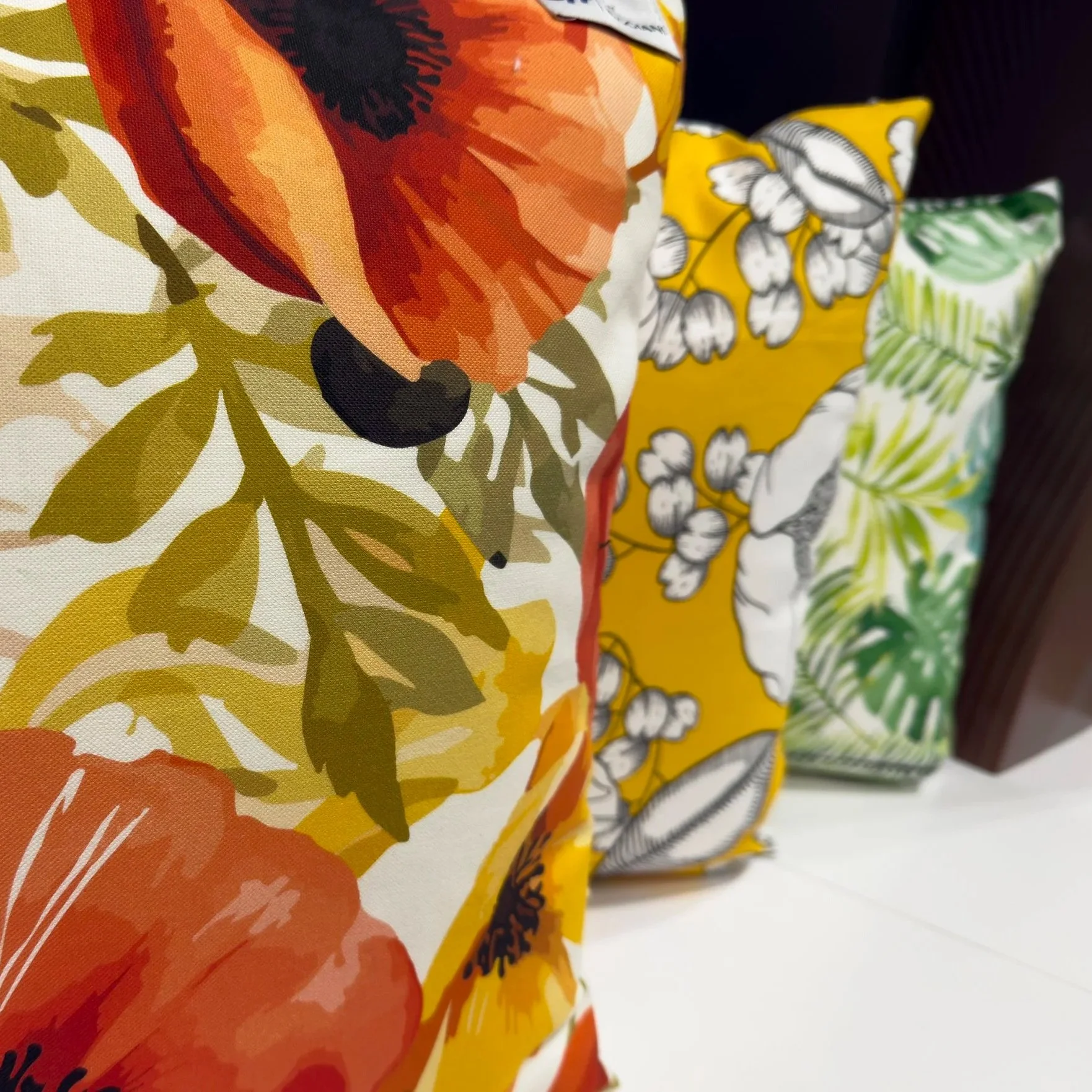
Still, customers have high expectations of the print quality: despite the relatively uneven surface, they expect a detailed and well-resolved print with a large color gamut. In direct-to-garment printing, the substrate is often a dark or black garment. In such cases, the use of white ink is a basic requirement for the printing process, because the CMYK inks used are not opaque but translucent. Without a white underbase, the print would be hardly visible. Sometimes white logos, halftone designs or even white photos are printed on dark textiles, which requires control of the linear reproduction of tonal values. In textile roll-to-roll printing, on the other hand, printing is mostly done on white or at least light-colored fabrics so textile roll-to-roll printing systems usually do not feature white ink.
In both direct-to-garment and roll-to-roll printing, additional colors such as red and green are often used for extending the color gamut. This means that, together with white and the subtractive primary colors cyan, magenta, yellow and black (CMYK), sometimes up to seven primary colors have to be managed.
The RIP: the data preparation hub
All these and more tasks are fulfilled by the RIP and color management solution. In the closer sense of the word, a RIP («Raster Image Processor») is a software or hardware component that converts print data into the output format of the press. This is not trivial because the popular PDF format, which is often used in prepress, stores information in a resolution-independent way whenever possible. The letter T, for example, is not defined as a collection of pixels but as a «vector graphic» consisting of basic geometric shapes such as lines, circles and curves. The core task of a RIP is to convert such image descriptions into the actual print resolution and raster format of the attached printing system. In practice, however, machine operators call practically any software a «RIP» that is used to control the printing system – even if it does nothing more than passing on existing pixel data, e.g. from Photoshop, to the printing system more or less unchanged. Professional RIPs, such as the Textile Productionserver from ColorGATE, are characterized by the following:

A RIP converts vector data into pixel data, features, among others:
■ Extensive linearization functions for ensuring a dynamic, well-graded ink application on the textile
■ Creation and flexible application of color profiles, in order to factor in the color characteristics of the input and output devices, as well as color deviations between production lots and temperature / humidity changes
■ High processing power to make sure that all those conversion processes don’t become the bottleneck in the production workflow. The objective is a fast, good and high-quality conversion of the print data, optimized for the characteristics of the printing system
■ A trusting working relationship between the developer of the RIP solution and of the printing system – to understand customer requirements and to fine-tune soft and hardware to each other
The linearization is an elementary prerequisite for successful color management. Imagine you want to print a gradient, for example in black, on a light-colored T-shirt - from zero to 100 percent ink coverage. You would be surprised how «uneven» the result will look when using the default settings of many printer drivers – after all, they are optimized to produce the most «colorful», saturated print image possible. This means that full area coverage is often produced even at tonal values of around 70 percent, and above that there are hardly any visible steps to be seen. However, if at certain values the colors hardly differ from each other, the next steps, such as the creation of color profiles, become difficult.
Hence, when linearizing the printing system with a professional RIP, the first step is to print a tonal value wedge and to measure the resulting density values. The RIP uses this to calculate a transfer curve that ensures, for example, that a color field with 50 % black is actually printed with half of the attainable area coverage.
Black generation settings during profile creation.

Color needs to be managed
Once this step is completed, the next challenge is tackled: color management, which is traditionally a core function of a RIP. Color management in textile printing follows the same approach that has been used for decades in the (paper) printing industry: it is based on a specification by the International Color Consortium (ICC).
Important for understanding this concept is the distinction between device-dependent and device-independent color. Common color specifications such as RGB and CMYK are usually device-dependent. This means that one and the same RGB value produces different colors on different hardware. Everybody who has ever compared the advertising screens hanging over a row of supermarket check-out desks knows this phenomenon: a red that should actually be the same is sometimes paler, sometimes more intense, sometimes a bit yellowish, sometimes blueish, depending on the device. The reason is the serial deviation of the devices, combined with different settings for brightness and contrast. One can easily imagine that the differences are even bigger on devices from different manufacturers, with their different masks, phosphors and controls.
The same applies to CMYK-based printing systems, which use inks with drastically varying pigments, dyes, viscosities and chemical compositions. Color definitions such as RGB or CMYK are therefore not suitable for professional color management. In order to be able to «translate» colors between different devices, a device-independent color definition is required. This is usually done using the L*a*b* color space as defined in DIN EN ISO 11664-4.
When printing on surfaces, we are dealing with subtractive color mixing: (more or less) white ambient light falls on a printed surface and certain wavelengths are absorbed or reflected by the surface. The wavelength distribution then addresses certain receptors in the eye of the observer, thus creating the color stimulus. This means that the spectral remission properties of an object are one important factor for an absolute color definition, but not the only one. Color perception also depends on the ambient light and the spectral sensitivity of the observer. In order to reduce the number of variables, the latter two are often standardized: for the light, the standard illuminant D65 is usually used for printing purposes in Europe, and a so-called «standard observer» is defined as the viewer.

Linearization curves for a six-color textile printing system.
All three parameters are initially available as spectral curves which are multiplied with each other and then mathematically integrated. In the end, each color is represented by three numerical values, the L*a*b* values. The dimension L* stands for the brightness of a color (0 for black and 100 for ideal white), a* denotes the green or red component and b* represents the blue or yellow component. A certain combination of these three values (for example, L* = 60, a* = – 52, b* = 41 for a saturated green) denotes a certain color in an absolute way, regardless of the device on which it is going to be output.
Color management in the sense of ICC now means to «translate» color from the color space of one device to the color space of another device. For each device involved, a so-called color profile is created, which represents the «color fingerprint» of the device. Simply put, a selection of device-specific color combinations (for example, CMYK values) is printed on the device.

Then, the resulting absolute L*a*b* color values are measured with a spectrophotometer. The result is a translation table for each specific device that describes which device-specific color needs to be sent to print in order to obtain a certain absolute color. In textile printing, there are some additional factors that influence the color beyond the specific device. Color reproduction can be changed by different fabrics and textiles, different pre-treatment methods, different temperatures of the dryer or the hot press. Theoretically, one would have to create a separate profile for each changing production condition, even if users practically work with a reasonable compromise.
This is another area where the wheat is separated from the chaff: while many «inexpensive» RIPs do not even include a profiling tool, the ColorGATE’s Textile Productionserver does not only offer a powerful color profiler but also extensive features for «updating» a color profile once it has been created. During profile creation, there are a number of assumptions and settings that have to be made, including those relating to black generation. These settings do not only influence the quality of the subsequent print output, but also the ink consumption.
However, while the creation of the basic profile requires qualified personnel and knowhow, the regular quality control and some adjustments can be carried out, for example, so that production can happen regardless of technology and location. Another option is «proofing»: in cooperation with brand owners, the textile printer can carry out color matching based on paper printouts produced on a «normal» inkjet printer. This printer can be located anywhere, even at the customer’s premises. Every print sample and sales material produced according to the standard gives a realistic picture of what is possible in production.
Control over color means business flexibility
Once you have acquired and calibrated this infrastructure comprising professional RIP, spectrophotometer and profiles, you can actively control color in your production process: if you use several digital printing systems in your production, maybe even from different vendors, color management can ensure that they produce color-identical results. Digital processes can even be color-matched to an analog system such as a screen-printing machine. Once a color standard has been defined and quality assured by absolute color measurement, the same color can be guaranteed across several production sites.
That way, the user can plan her / his machine allocation according to economic criteria and does not have to print all copies on the same machine or at the same location. This means that production can happen regardless of technology and location. Another option is «proofing»: in cooperation with brand owners, the textile printer can carry out color matching based on paper printouts produced on a «normal» inkjet printer. This printer can be located anywhere, even at the customer’s premises. Every print sample and sales material produced according to the standard gives a realistic picture of what is possible in production. In other words, active color management is an absolute prerequisite for efficient and economical work, as it saves faulty productions, complaints and disappointed expectations.
Special textile features
In addition to pure color management, a professional RIP solution fulfills other important tasks in the production process.
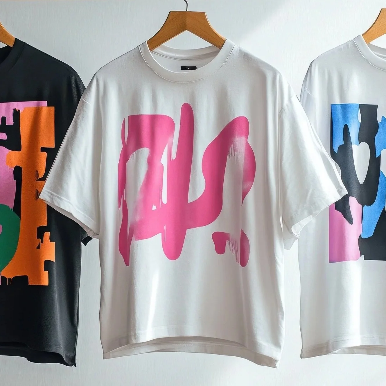
Print service providers often receive files from agencies and designers with spot colors, for example with the recently announced «Pantone Color of the Year», Classic Blue. In professional prepress, spot colors are not defined as a mixture of primary colors but are embedded in the file as an additional «separation». In the days of analogue printing, a separate film or printing plate was created containing the spot color.
Some print service providers try to convert such spot colors into the primary colors cyan, magenta, yellow and black, accepting the fact that such a conversion may cause inaccuracies or that the saturation of a particular spot color may be reduced. A good RIP has spot color features on board with which Pantone or HKS colors can be defined device- independently. The user can then have the print file with the additional separation calculated by the RIP without further ado and obtain correct and brilliant results.
It is often a good idea to take the color of the fabric into account when printing textiles. Let's imagine we wanted to print a portrait on a black T-shirt where the depicted person wears dark sunglasses. As described before, one would usually print a layer of white ink as underbase first, because otherwise the translucent CMYK inks would be hardly visible. The face would be composed of the usual primary colors, in this case probably with high proportions of magenta and yellow, and the sunglasses would be printed with black ink.
A professional RIP solution, on the other hand, determines before printing whether the same or an even better impression can be achieved by using the original color of the textile, by leaving out the white underlay in the appropriate places and not using the other colors at all. This is called a «knock-out». The result will not only have much more contrast, it will also have a better textile «feel» due to the lower ink application which also reduces the printing costs.

The same applies to so-called «semi-transparencies», Print sample with black knock-out and semi-transparencies. i.e. areas in which the color of the textile is included in the design of the printed image and is overlaid by slight amounts of printing ink. Here, ColorGATE’s Textile Productionserver offers numerous setting options for the white coverage as well as for the transition between ink and textile. This enables astonishing results, especially if the edges of the design contain gradients or cloudy structures.
Last not least, a RIP can also help to resemble an analog print beyond color.
Textile printers and finishers often produce larger orders on an analog process (e. g. on a screen-printing carousel) and later produce smaller re-runs on a digital system for economic reasons. It goes without saying that the products of both production runs should look as similar as possible. This is not only a matter of the color, but also of the overall screen-printing impression, which is mainly created by the printing screen used there.